Choosing the right quilting color schemes can make or break your quilts. Let me show you how to create color schemes for quilts that are bound to impress.
So you’ve come across one of those beautiful quilt patterns (hopefully in our shop) and now it’s time to get some fabric. As fun as that is (it is so fun, right?), it can sometimes be frustrating or confusing. With all those pretty fabrics and colors it can be really hard to choose quilting color schemes that really work well.
I get it. I’ve been there multiple times. It’s very easy to get seduced by those fabrics and end up buying things that don’t even go well together. That’s why I think planning is key. And today we’ll take a look at how to plan quilting color schemes that will work like a charm every time.
How do I choose a color scheme for a quilt?
Choosing quilt colors is probably one of the most important steps when planning a quilt. A balanced quilting color scheme can make or break the final effect of the quilt, so you want to give this process the attention it deserves.
You’ll probably start off with some of your (or the quilt recipient’s) favorite colors, but what next?
In this article, I will show you some foolproof quilting color combinations that you can use regardless of what your favorite color is or who you’re making the quilt for.
If you’ve been following along for a while, you might have read one of my previous articles about the quilting color wheel. If you haven’t read it, I strongly encourage you to go ahead and take it all in because it’s the basis for everything we’ll be talking about here today.
You see, every single hue you can think of has a specific place on the color wheel. And that place determines how well it’s going to get along with other hues on the spectrum. If you know how to read the color wheel, you can instantly find colors that will work well together (and colors that won’t).
In the Quilting Color Wheel article, we dove into all of these quilting color schemes in theory. Today, we’ll take a look at how these different quilt color combos work in real life. Fun, right?
What colors go together in quilts?
I promised I wouldn’t get too technical in this article, so I suggest we go straight to real-life quilt examples. We’ll take a look at all the ‘classic’ quilting color schemes that work no matter what type of quilt you are making.
Monochromatic Quilting Color Schemes
A monochromatic color scheme is probably the easiest (or safest) way to create a good-looking color palette. It’s made of different shades, tones, and tints of the same color. This means it’s pretty much impossible to choose colors that don’t work well together, because you’re only using one chosen hue.

Here are some examples.

Ombre Infinite Hearts by Quilty Love
Ombre quilts are very typical examples of monochromatic quilts. The ombre effect is easily achieved by using different tints of one chosen color (a tint is created by adding white to the basic hue). In this Ombre Infinite Hearts quilt, the ombre effect is applied to each heart block individually. You’ll also often see ombre quilts with the ombre effect applied to the entire quilt top as a whole.

Lily Quilt by Alderwood Studio
This green Lily quilt by Alderwood Studio is a beautiful example of a monochromatic color palette. Using a variety of tints of the chosen green hue, Amber created a very calm harmonious effect, which is, in my opinion, perfect for this pattern.

Underlined by Designed to Quilt
Our (free) Underlined quilt pattern here is made in two blue hues. I’ll admit, this perhaps isn’t a ‘pure’ example of a monochromatic quilt as these two blues probably aren’t the exact same hue. But I think it’s still a good example of an ‘all-blue’ quilt, which makes it more monochromatic than anything else.
Interestingly, when making this quilt, I had a strong urge to add something yellow to the quilt (which I did with that short section of yellow binding). This goes to show how we sometimes subconsciously try to balance out a dominating color by using a complementary pair.
If you want to make it yourself, this is actually a free pattern we offer to our subscribers. If you want a free PDF copy, sign up for our newsletter here.
Complementary Quilt Color Schemes
Complementary colors are colors that lie right opposite each other on the color wheel. Even if you don’t know the color theory, I’m sure you’ve found yourself pairing them in the past. That’s because they tend to balance each other out.

These typical color combos are blue and yellow, purple and green, red and cyan, etc. When using complementary colors on a quilt, we often tend to add some neighboring colors to the mix, turning them into split-complementary color schemes.
That’s why a real complementary quilt color scheme is actually harder to come by. But here is one excellent example.
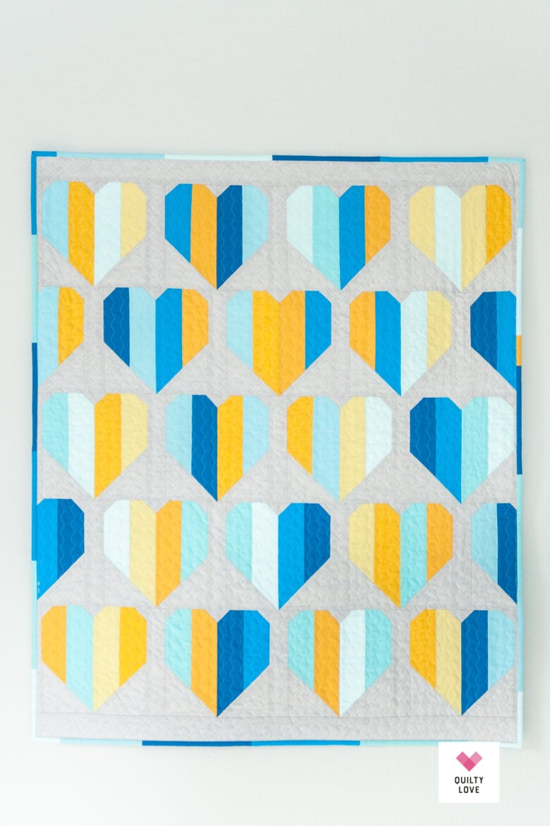
Infinite Hearts by Quilty Love
This is similar color combination as in the previous example. Here the quilt only uses tints of one chosen blue hue and pairs them with the opposite yellow hue. This creates a balance on the quilt and at the same time adds a lot of visual interest.
Analogous Quilting Color Schemes
Analogous colors lay next to one another on the color wheel. They work well together because they blend one into the other.

You could use as many different hues as you like, but to keep it simpler, it might be best to stick to about 3 to maybe 4 hues to keep that harmonious feel.
Let’s take a look at a few beautiful examples of analogous quilting color schemes.

Herringbone Quilt by Designed to Quilt (FREE pattern)
When choosing colors for our herringbone quilt we wanted to create an ombre effect, but with multiple colors (rather than monochromatic). We naturally gravitated to these colors, but you can see why. They all lay close one to the other on the wheel, and blend beautifully one into the other. Even though they are not arranged in the same order on the quilt top as they are one the color wheel.

All the Hearts by Polkadot Chair
This All the Hearts quilt is a great example of an analogous quilt color scheme. The pinks, reds, oranges, and yellows really work well together, right? And they are perfect for this specific pattern as they are warm, vibrant, and energetic.

Banff Quilt by See Kate Sew
The color scheme of this quilt is perhaps not the most obvious analogous example. But that’s exactly why I wanted to include it here, so you can see the variety this color scheme offers. Kate uses the neighboring pink, rusty, orangey hues and pairs them with white and black to create a contrasting look. Since white and black aren’t on the color wheel, they (in theory) go together with any given color, so if you’re looking for a strong visual effect, black or white might be the way to go.

Star Fall by Quilty Love
Another way to use analogous colors is to create an ombre effect (with more variety than a classic monochromatic ombre). Since the colors are sitting right next to one another on the color wheel, you know they will blend perfectly, creating a beautiful overall look.

Simple Quilt With Squares by Designed to Quilt (Free Pattern)
Here’s another example of using an analogous color scheme with an ombre effect. Since the pattern is a simple patchwork, we experimented with the arrangement of the squares. We started with an ombre colorway in the top right corner and then mixed the squares to create a playful pixelated quilt.
Split-Complementary Color Schemes for quilts
A split-complementary color scheme is kind of like a crossover between a complementary color scheme and an analogous color scheme. Basically, you take two complementary colors and add a couple of neighbors to one of the chosen colors.
Or, what I tend to do subconsciously, start off with an analogous color palette and then add a complementary color as a pop, an accent that brings the whole thing together.
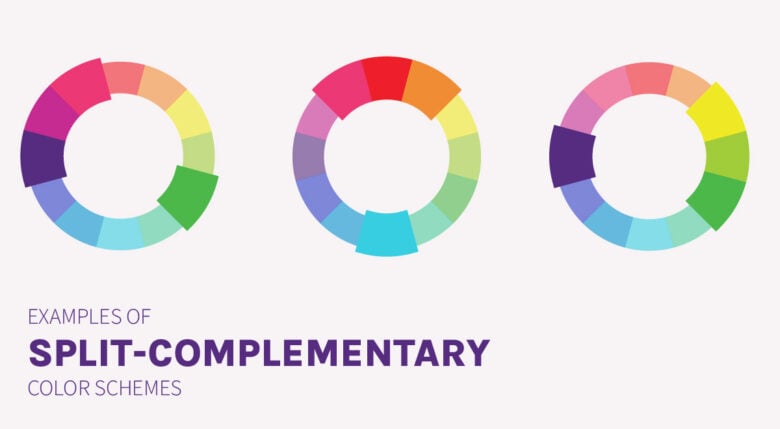
I’ve noticed it’s one of the most used quilting color schemes in my quilts, probably because it always creates a harmonious effect, but also adds that visual interest of the complementary color.
Here are some examples.

Mirror Maze by Designed to Quilt
For this baby boy quilt, we selected shades of blue and green, balanced with bright tints, and accented with a complementary yellow hue. The choice of yellow brings a sense of playfulness to the pattern.

Deep Diving by Designed to Quilt
This Deep Diving Quilt here uses only analogous colors on the quilt top itself. However, the binding is done in a complementary orange-red hue, balancing out the cold blues with a warm energetic orange accent. I really think it transforms the quilt and brings it to a whole new level.
Want to make your own? You can get a pattern in our pattern shop.

Simple Heart Quilt by Cluck Cluck Sew
Here, a true split-complementary color palette is used on individual heart blocks that create a harmonious look. The reds, pinks and oranges pair perfectly with the cyan, which is the exact opposite on the quilting color wheel.

Flying Goslings by Designed to Quilt (Free pattern)
This little Flying Goslings quilt is another example of creating a split-complementary color palette without thinking about color theory. I started off with shades of blue and aqua but I knew I needed something to balance all of this off. So I added a row of yellow flying geese to bring the whole thing together.
If you want to make your own, you can get the free Flying Goslings quilt pattern here.
Triadic Quilting Color Schemes
Triadic colors are three colors that are evenly spaced on the color wheel. This means that you have one color from each part of the color wheel, creating a harmonious and balanced combination.

Here are two quilts that use the triadic color scheme beautifully.

Super Star Quilt by Sew Can She
This modern star quilt features simple stars in fuschia, turquoise and citron, which creates a very balanced look. Each of these three colors ‘pulls’ in one direction on the color wheel, which means they balance each other out.

Modular Blocks by Purl Soho
The Modular blocks quilt (which we also included in our Minimalist modern quilt Patterns roundup, we just love it so much) makes use of similar colors (and some added hues that are close by on the wheel). A light grey fabric is added, which acts as a neutral and in this case, also ‘grounds’ the bright vibrant colors of the quilt top.
So these are the 5 basic quilting color combinations (with real-life quilt examples) that I think are super helpful as a starting point to learn about color schemes for quilts.
There are of course many other color combinations that you can get from the color wheel. And also, as much as these textbook examples definitely do work, I am not saying this is the one and only way to pair colors for your quilts.
Color theory is, however, a great place to start. It offers a reference point for when you feel in doubt, and a ‘recipe card’ for when you’re confused about the color choices.
What do you think? Do these quilting color schemes work and do you see yourself using them in your fabric pulls? Or do you prefer to play it by ear, so to speak? I’d love to hear in the comments below!
Quilting Color Schemes FAQs

Finish Your Quilt Effortlessly
Quilt Geek calculates every measurement you need, so your quilt turns out perfect every time.
START YOUR 7-DAY TRIAL FOR $0!
Cancel anytime.


About The Author
Ula | Designed to Quilt