The quilting color wheel is what you’ve always needed (but never knew you did). Learn how the color wheel for quilting works and choose fabric colors like a pro.
Choosing colors for a quilt can be an intimidating process. Whether you’re choosing fabrics to make your quilt top, your backing, or even your binding, you want your colors to go together.
Perhaps you find combining colors comes easy, and you’re one of the lucky quilters born with an innate feeling for colors. But maybe you struggle and you feel like you can’t pair even two colors and make it look right…
Luckily, pairing colors is something that can actually be learned. Sure, it is great to have that gut feeling. But even if you don’t, you can train your eyes (and your brain, really) to see why two colors look great together while two other hues just down work.
The color wheel is a great tool to help you with that. In this article, we’ll take a look at the color wheel for quilters and learn how it can help us make better color choices for our quilts.
Consider it an introduction to color theory for quilters. And what better way to start than with some basic color vocabulary?
Basic Color Vocabulary
The quilting color wheel is of course part of color theory, so it might be useful to first get some terminology out of the way. This color vocabulary is used anywhere color theory is applied, so you might know these terms from graphic design, painting, etc.
Hue
Put simply, a hue is any of the colors on the color wheel. On the RGB color wheel we are using here, there are 12 hues: red, orange, yellow, chartreuse green, green, spring green, cyan, azure, blue, violet, magenta, and rose.
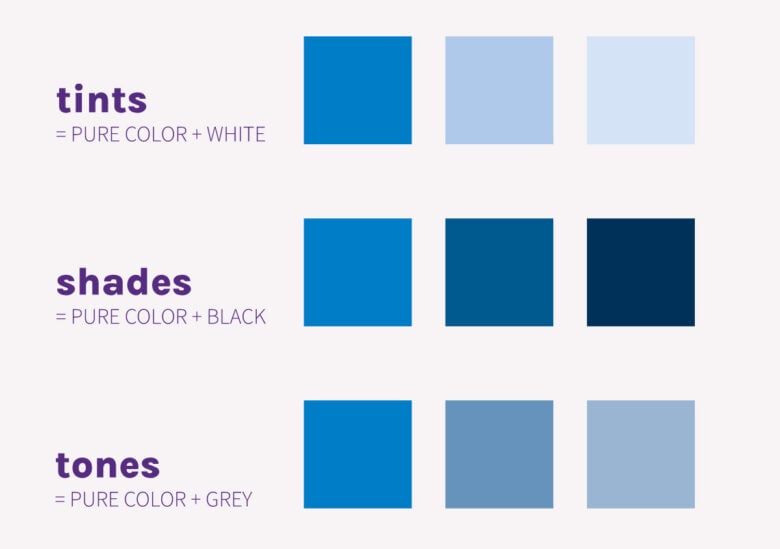
Hues are pure colors, meaning they don’t have any white or black (or grey) added to them.
Tint
To create a tint, white is added to the basic hue. This makes the hue lighter. It can also make it look less intense, so it works well for balancing out more vivid colors. Tints are also called pastels.
Shades
To create a shade, black is added to the basic hue. This makes the hue darker. It also makes it appear deeper and richer.
Tones
To create a tone, black and white (or grey) is added to the basic hue. This tones down the intensity of the basic hue and at the same time adds complexity. Tones can be perceived as more subtle and sophisticated as opposed to bright pure colors and/or pastels.
Adding tints, shades, and tones to a color wheel creates a so-called expanded color wheel.
Value
In quilting patterns and quilt talk in general, you might come across the term value. Value in quilting (and in color theory) is the relative lightness or darkness of a color. You’ll often see the value of fabric defined as light, medium, or dark.
Notice how I used the word relative. That is because unlike tints and shades (which are absolute, meaning you get a specific tint by adding a specific amount of white to a specific hue), the value of a given color (or fabric in our case) is relative to what surrounds it. To put it in another way, it is determined by the lightest and darkest fabric in a selection. The same fabric can be light, medium, or dark depending on what fabric is next to it.

Understanding value plays an important part in fabric selection. It can be used to create contrast, emphasis, and balance on the quilt. In fact, In fact, I think it’s such an important thing to understand, it deserves a separate post. I’ll add a link here when it’s on the blog.
What is a quilting color wheel?
Now that we got the basic lingo out of the way, let’s take a look at the quilting color wheel.
A color wheel (any color wheel, not just in quilting) is an abstract illustration of color hues organized around a circle. It shows the relationships between different hues on the spectrum.
The wheel makes color relationships easy to see by dividing the spectrum into 12 basic hues. It can be of great help when deciding which colors go well together, as we like to say.
Contrary to what you might think, more than one version of the color wheel exists. That is because the color wheel is of course a human invention and the way the colors are organized around the circle depends on the medium you are working with.
I am sure this is all a bit confusing but bear with me, as I explain a bit more about the difference between the color wheel you might know from school (the RYB color wheel) and the ‘mathematically more accurate’ color wheel (the RGB color wheel). It will all make sense in the end, I promise.
The RYB (Red-Yellow-Blue) Color Wheel
Most of us probably remember a specific version of the color wheel back from art class – the RYB (Red-Yellow-Blue) that looks something like this:
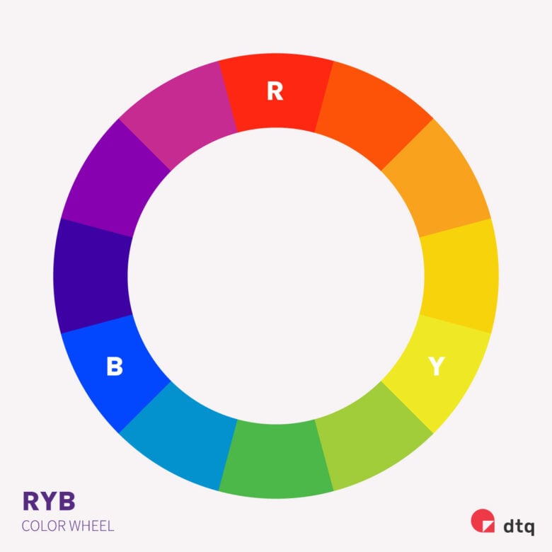
The three primary colors in the RYB color wheel are red, yellow, and blue. These three colors can’t be created from other colors, and all other colors are created from them. If you ever mixed paint you know that this is true. Mixing yellow and red produces orange (a secondary color), yellow and blue give you green, etc.
This is why the RYB color wheel makes complete sense when mixing paint pigments. Painters have always and still use these three primary colors in paint, mixing them to get other colors. This is also why the RYB color wheel is sometimes called a Painter’s Color Wheel. It is a great tool to help artists get the colors they want in color pencils, ink, paint, pastels, and other subtractive color mediums.
The RGB Color Wheel
As quilters, however, we are not really that interested in how different hues are created. Instead, we’re interested in how the colors are perceived. And scientifically, color is an expression of light.
Without getting too technical here, the RGB (Red-Green-Blue) Color wheel (also called the Light color wheel) mimics the color of the light (as opposed to pigments). It looks like this:

The three primary colors in the RGB color wheel are red, green, and blue. Mixed together, they produce white. Mathematically speaking, the relationships between different hues are more balanced when using an RGB color wheel because they mimic the color of light (and not pigments, like the Painter’s color wheel).
And that’s why I’ll be using the RGB Color Wheel as the basis for the color wheel for quilters we’ll look at in a bit.
I’d like to point out that this is a 12-step color wheel. This is of course a big simplification, but it helps us understand the colors on the wheel and their relationships.
In reality, there are infinite colors on the color wheel. To get a better perception of it, I suggest you play a bit with a color wheel in a design program like Adobe Photoshop or Illustrator. There are also many available online for free, I particularly like this one from Canva. Especially because it lets you preset the different color combinations that I’m about to explain, making it really easy to find colors that work well together.
The Quilting Color Wheel Color Combinations
The true value (and I’m not talking about the color value) of the color wheel for quilters is in the color combinations.
As I’m sure you know, different hues have different relationships with one another. Some get along well, others bicker all the time. Just joking, but not really.
There is actually a mathematical way of ‘calculating’ how a hue will pair with another hue. And the color wheel is basically just a visual representation of all that math.
In this article, we’ll take a look at these different relationships in theory. This will set the base for understanding how pairing colors (and fabrics) can be approached in a more scientific way. In the next article in this series, we’ll take a look at how these color combination work in real life on real quilts. I’ll add a link here when the article is on the blog.
There are more ways than what we’ll cover here to create harmony with colors, but we’ll look into what is most applicable in (modern) quilting.
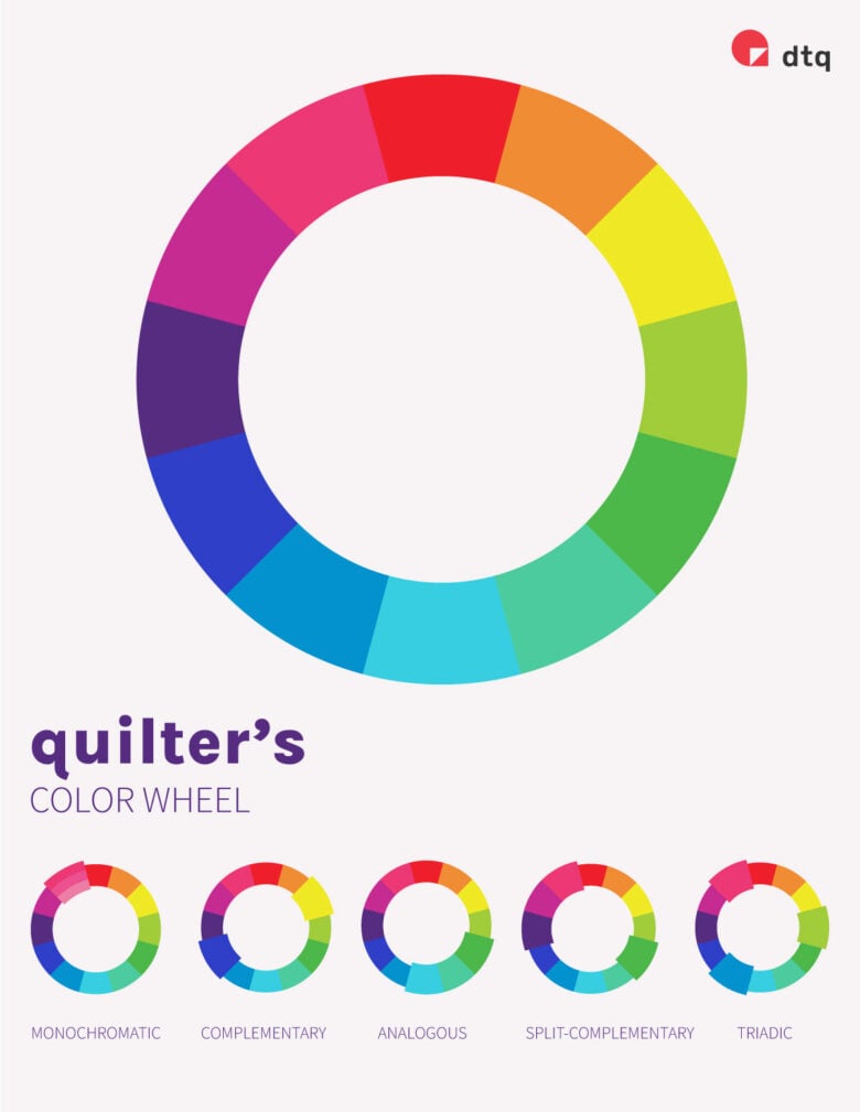
Also, because the RGB color wheel uses colors that can be seen on screens, we’ve taken the liberty to adjust the colors to be more ‘fabric-like’. This gives us this quilter’s color wheel that we’ll be using from now on.
The Monochromatic Color Palette
A monochromatic color palette consists of different shades, tones, and tints of the same color. Because you’re working with one basic hue, this is a pretty ‘safe’ palette and a foolproof way to create a harmonious effect.
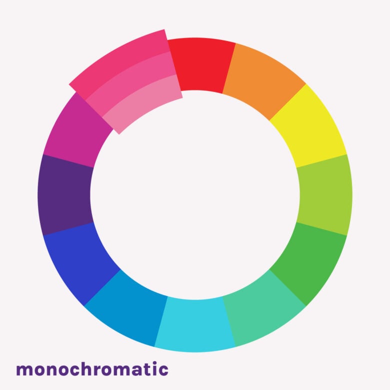
The monochromatic color palette can be seen on many modern quilts with a so-called ombre effect. An ombre color palette is just that – different shades, tones, and tints of one chosen color arranged by value to create a ‘fading’ effect. Very often in ombre quilts, the basic color is combined with a much higher (or lower) value fabric for background.
The Complementary Color Palette
Two colors that are on opposite sides of the color wheel are called complementary. In this case, opposites attract. Complimentary colors create a high-contrast color combination. But at the same time, they balance each other out, creating a harmonious effect.

Examples of a complementary palette are yellow and blue, red and cyan, or magenta and green.
Of course, in quilting, we will rarely use just the basic pure hues. So when planning a complementary color palette, think of all the derivative colors of the chosen hue, including shades, tones, and tints.
The Analogous Color Palette
Colors that are next to one another on the color wheel are called analogous. They work well together because they blend into one another. With a 12-step color wheel, I’d suggest sticking to a maximum of three analogous colors to keep that harmonious feel.

Analogous colors (and their shades, tones, and tints) can also be used to create a more diverse ombre effect as they blend nicely one into another.
The Split-Complementary Color Palette
A split-complementary color palette is kind of a mix of a complementary color palette with an analogous color palette. It’s created by pairing two hues that are opposite (complementary), along with the 2 colors adjacent to one of them.
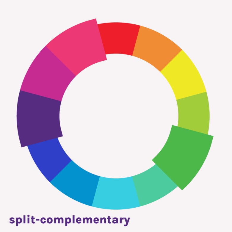
I use the split-complementary color palette all the time. I like how the analogous colors create interest and depth, while the complementary color balances everything out by providing an accent from the opposite side of the spectrum.
The Triadic Color Palette
When combining three colors that are evenly spaced on the color wheel, you get a triadic color palette. This still provides a contrasting color scheme, but much less than a complementary palette, as the colors are closer to one another on the wheel. This makes it more versatile.

If you’re looking for a vibrant (but still balanced) color scheme, triadic is the way to go.
Color Temperature
Another great use of the color wheel is that it helps us understand color temperature, i.e. distinguish warm colors from cool colors.
Warm colors are all colors that contain orange, red, yellow, and combinations of these and similar colors. We tend to associate these colors with warmth, positivity, energy, etc.
Cool colors on the other hand are colors that contain blues, greens, and light purples. They are perceived as cool, calm, and soothing.

Color temperature can be a very good tool when planning colors for a quilt, where you want to distinguish foreground elements from the background. Typically, warm colors pop, while cool colors recede. This makes the elements of the quilt in warm colors perceived as the foreground or even closer than the elements in cool colors.
The quilting color wheel makes it very easy to know whether a color is warm or cool as half of the wheel consists of warm hues and the other half cool.
I hope this article has shed some light on the theory behind pairing colors. It might be a bit technical, but as I’ve said, consider this an introduction, as we’re also working on some more practical applications which we discuss in the Quilting Color Schemes for the Modern Quilter. I definitely recommend that for further reading!
We’d love to hear how you go about choosing colors for your quilts. Do you ever use a quilters color wheel, or go simply by gut feeling? Tell us all about it in the comments below!


I am always amazed at the theory (and true science) behind it all. I’ve always gone with my gut, sometimes successful and, often enough, not, when it comes to color combining. I am excited to use the Quilter’s Color Wheel and share it with our fellow artisans. Thanks for sharing your knowledge.
It’s really fascinating, isn’t it? There really is a scientific reason why some colors go together and some don’t. Even as graphic designers we sometimes can’t believe how ‘simple’ these things are… We’re glad to hear you find this helpful!